Unit 1 · 4 teaching hours · 23 min read
Introduction to UX and UI
What the syllabus asks for 8
- What is UX? What is UI?
- Why design matters
- Core UX principles
- The core disciplines of UX
- Types of user interface
- Properties of good UX/UI design
- UX/UI tools
- Seeing the ideas: interface types, the honeycomb, contrast, the UX loop and a good form
Every app you love and every form you hate was designed — or was not.
This unit separates user experience (UX) from user interface (UI), states the principles that make products usable, names the disciplines inside UX, and surveys the kinds of interface and the tools designers use.
- UX versus UI, and the tasks of a UX designer and a UI designer.
- The core principles: usability, accessibility, simplicity.
- The six disciplines of UX.
- Interface types: CLI, GUI, VUI, menu-driven, NLP-based.
- Properties of good UX/UI design and the industry tools (Figma, Adobe XD, Sketch).
1.1 What is UX? What is UI?
User experience (UX) is the whole of a person's interaction with a product or service: how easy it is to learn, how efficient, how pleasant, how trustworthy — before, during and after use.
User interface (UI) is the part the user sees and touches: screens, buttons, colours, type, icons, layout, sounds and animations.
UI is the steering wheel, pedals and dashboard; UX is whether the whole journey — finding the car, driving, parking, refuelling — felt easy and safe.
| UX design | UI design | |
|---|---|---|
| Question | Does it solve the right problem in an easy, useful way? | Does it look and respond clearly and consistently? |
| Focus | research, flows, structure, usability | visual design, components, interaction details |
| Deliverables | personas, journey maps, information architecture, wireframes, test reports | style guide, colour and type system, high-fidelity mock-ups, component library, animations |
| Metrics | task success, time on task, satisfaction (SUS) | consistency, readability, visual polish, accessibility contrast |
| Comes | first, then continues | after structure is settled, then continues |
A beautiful UI on a confusing flow is bad UX; a clear flow in an ugly UI is weak UI. A product needs both. In small teams one person does both.
Tasks of a UX designer
Understand users and the business problem (interviews, surveys, analytics); define personas and scenarios; map user journeys; structure the content (information architecture); design flows and wireframes; prototype and test with users; iterate; work with developers and product managers.
Tasks of a UI designer
Translate wireframes into visual design; choose the colour palette, typography, spacing and iconography; build a design system of reusable components; design for different screens and states (hover, pressed, disabled, error, empty, loading); prepare assets and specifications for developers; keep the product consistent.
1.2 Why design matters
- Business: good UX raises conversion, retention and trust, and cuts support cost. Fixing a usability problem in design costs a small fraction of fixing it after release.
- Users: saved time, fewer errors, access for people with disabilities.
- Safety: a confusing medical device or banking screen causes real harm.
- Local context: Nepali users switch between English and Nepali, use low-end phones and slow connections — design must be light, legible and tolerant.
1.3 Core UX principles
Usability
ISO 9241-11 defines usability as the effectiveness, efficiency and satisfaction with which specified users achieve specified goals in a specified context. Nielsen breaks it into five qualities:
| Quality | Meaning | Test question |
|---|---|---|
| Learnability | how easy for first-time users | can a new user do the task unaided? |
| Efficiency | speed once learned | how long does an expert take? |
| Memorability | can returning users remember how | after two months, can they still use it? |
| Errors | how many, how severe, how easy to recover | how many wrong turns, can they undo? |
| Satisfaction | how pleasant | would they use it again? |
Accessibility
Designing so people with visual, hearing, motor and cognitive impairments can use the product — and everyone in poor conditions (sunlight, one hand, noise).
The standard is WCAG (Web Content Accessibility Guidelines), organised under four principles, POUR: Perceivable, Operable, Understandable, Robust.
Examples: text alternatives for images, captions for video, keyboard operability, sufficient colour contrast, no information conveyed by colour alone, resizable text, clear error messages.
Accessible design usually helps all users (curb-cut effect).
Simplicity
Remove what is not needed; make the next step obvious.
Practical rules: one primary action per screen, progressive disclosure (show advanced options only when asked), plain language, sensible defaults, fewer choices (Hick's law, Unit 3).
Simple does not mean few features; it means features are organised so that the user is never overwhelmed.
Other widely used principles: consistency (same things look and behave the same), feedback (every action gets a visible response), affordance (an object suggests how it is used — a button looks pressable), error prevention, and recognition over recall.
1.4 The core disciplines of UX
| Discipline | What it does |
|---|---|
| User research | learn who the users are, what they need and how they behave: interviews, surveys, observation, analytics |
| Content strategy | decide what content is needed, its wording, tone, structure and who maintains it ("UX writing", microcopy such as button labels and error text) |
| Information architecture (IA) | organise and label content so people can find it: sitemaps, navigation, taxonomies, card sorting |
| Interaction design (IxD) | design how the user and system respond to each other: flows, states, gestures, feedback, micro-interactions |
| Visual design | the look: layout, colour, type, imagery, consistency, brand |
| Usability evaluation | test whether the design works for real users: heuristic evaluation, usability testing (Unit 7) |
These loop rather than run in a line: research informs IA, IA informs interaction, visual design clothes it, evaluation sends you back to research.
1.5 Types of user interface
| Interface | How the user acts | Strengths | Weaknesses | Examples |
|---|---|---|---|---|
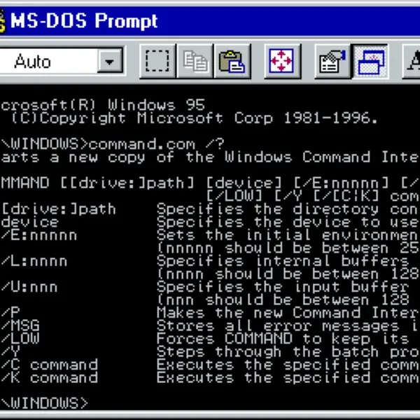
| CLI command-line | types commands | fast, scriptable, powerful for experts | steep learning curve, no discoverability | Bash, PowerShell, Git |
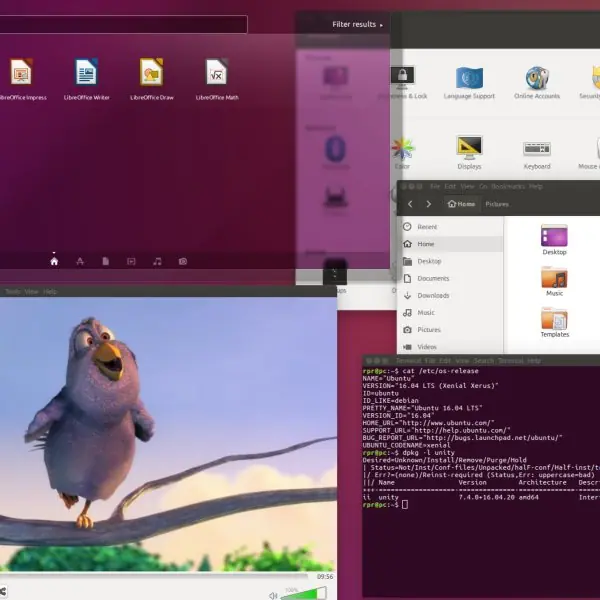
| GUI graphical | windows, icons, menus, pointer (WIMP), touch | discoverable, visual, easy to learn | needs screen and hardware; slower for repetitive tasks | Windows, Android, Figma |
| Menu-driven | selects from lists of options | no memorisation, constrained choices | deep menus slow experts | ATM, phone IVR trees, old DOS apps |
| Form-based | fills in fields | structured data entry | long forms tire users | registration, tax forms |
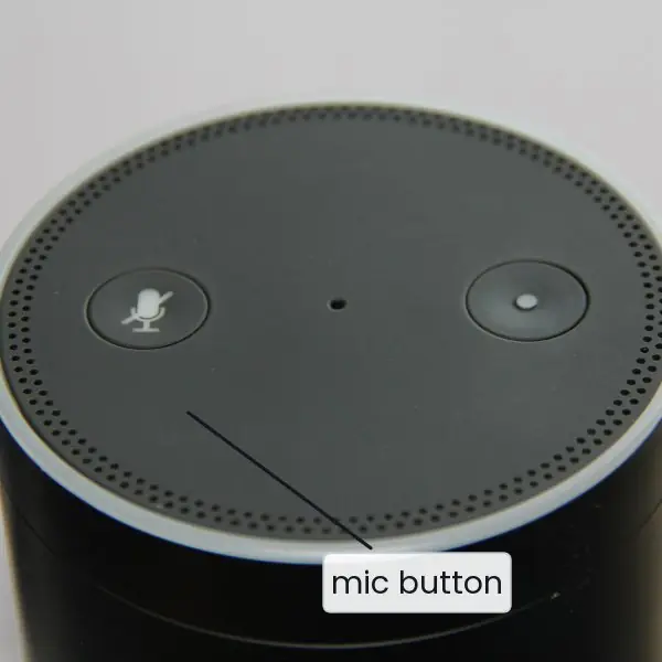
| VUI voice | speaks and listens | hands-free, accessible for blind users | recognition errors, no privacy, hard to scan options | Alexa, Google Assistant, in-car voice |
| NLP-based / conversational | writes or says natural language | flexible, low learning | ambiguity, unpredictable replies, hard to show options | chatbots, LLM assistants |
| Touch / gesture / AR/VR | taps, swipes, moves | direct, immersive | no hover, fat-finger errors, fatigue | phones, VR headsets |
Choosing the interface type is a design decision: a power-user developer tool deserves a CLI; a bank app needs a GUI; a car needs voice.
1.6 Properties of good UX/UI design
A good design is useful (solves a real need), usable, findable, credible/trustworthy, accessible, desirable and valuable (these are Peter Morville's UX honeycomb facets).
In the interface itself, look for: clarity (no ambiguity), consistency, feedback, efficiency (shortcuts for experts), error tolerance (undo, confirmations for destructive actions, forgiving input), visual hierarchy, aesthetic integrity and performance (a slow screen is a bad screen).
1.7 UX/UI tools
| Tool | Notes |
|---|---|
| Figma | browser-based, real-time collaboration, auto layout, components and variants, prototyping, dev mode; free plan; industry standard today |
| Adobe XD | Adobe's design/prototyping tool (integrates with Photoshop/Illustrator); now in maintenance mode — Adobe stopped adding features, so courses mention it but new work usually starts in Figma |
| Sketch | macOS-only vector UI tool that popularised symbols and plugins |
| Others | Penpot (open source), Balsamiq (low-fidelity wireframes), Miro/FigJam (whiteboards and journey maps), Maze/UserTesting (remote usability tests), Zeplin (hand-off) |
Whatever the tool, the skills are the same: frames and grids, components, constraints/auto-layout, colour and text styles, prototypes and hand-off to developers. The 48-hour lab in this course is done in one of these tools (Unit 6 lists the exercises).
1.8 Seeing the ideas: interface types, the honeycomb, contrast, the UX loop and a good form
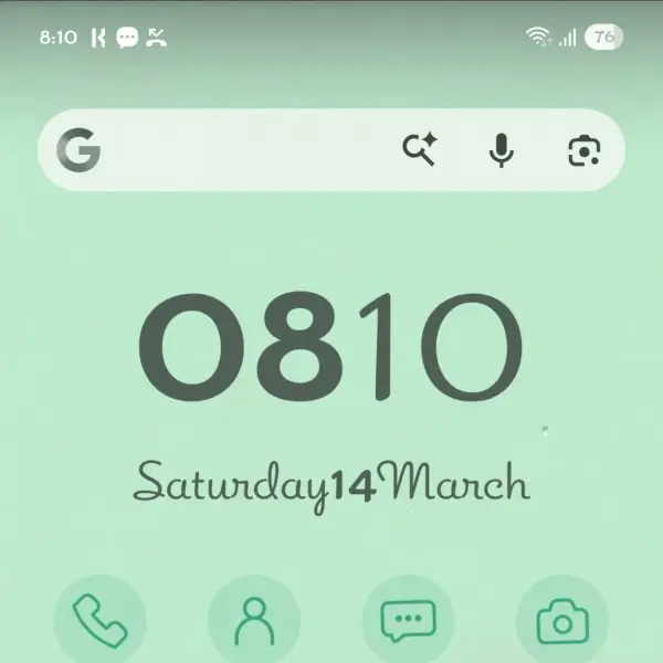
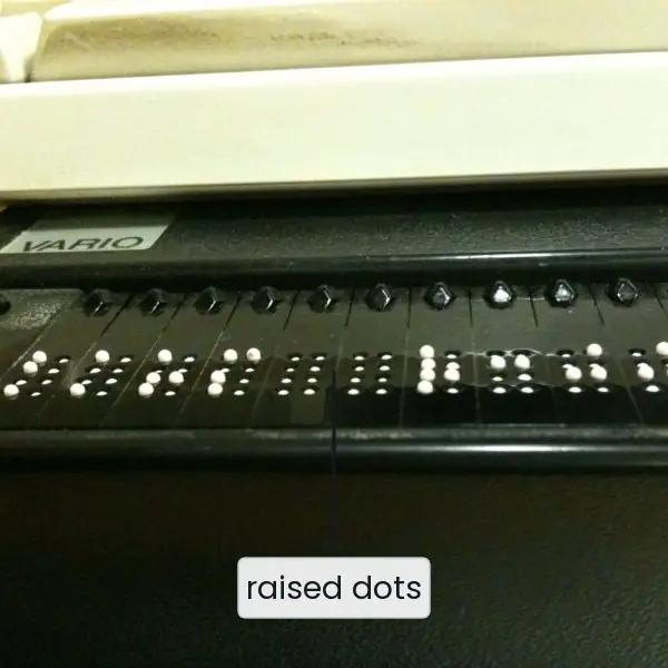
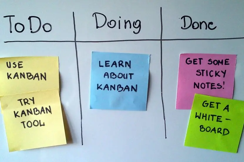
UX and UI are easy to define and easy to confuse, so this section shows them. The first plate puts five real interfaces side by side, from a text terminal to a tactile Braille display. The second plate shows two tools of the trade.
The figures then draw what the words claim: UI inside UX, Morville's honeycomb, the WCAG contrast test computed on real colours, the six disciplines as a loop, and the same form designed badly and well.



1.8.1 Eight benefits of good UX/UI design in Nepal
- Faster completion of tasks. A well-designed form lets a citizen finish an online task in minutes instead of a visit to an office. A passport or licence application with clear steps, labels and a progress bar saves a day of travel. Time on task is one of the main usability measures. Every removed field is time given back to thousands of users.
- Fewer errors and less rework. Labels, format hints and specific messages, as in Fig. 1.5, stop people entering the wrong data. A wrong account number in a banking or ConnectIPS transfer can be costly, so confirmation screens and clear summaries matter. Fewer errors mean fewer complaints and fewer corrections made by staff.
- Trust in digital payments. People move money only through an app that feels safe and predictable. Fonepay QR scans, eSewa and Khalti wallets show a clear amount, a payee name and a visible success message. This feedback tells the user that the action worked. A confusing screen makes people go back to cash.
- Access for every user. Good contrast, large touch targets, readable Nepali (Devanagari) text and screen-reader labels make a service usable by older people, people with low vision and people in bright sunlight. Fig. 1.3 shows how to test contrast with a number. Accessibility also helps the user on a cheap phone in a village.
- Lower training and support cost. An interface that is learnable needs a shorter manual and fewer helpdesk calls. A college result portal or an IRD tax portal with obvious steps saves staff time. This matters in offices where one clerk serves many users every day.
- Higher adoption and retention. An app that is pleasant to use gets used again. Pathao, Foodmandu and the banking apps of Nepali banks compete on speed and ease as much as on price. A good first experience brings users back; a poor one is deleted within a day.
- Better use of small screens and weak networks. Most Nepali users meet the web on a phone, often on a slow connection. A simple layout, one main action per screen and light pages load quickly and are easy to use with one hand. Simplicity is a technical benefit as well as a visual one.
- A stronger brand and a competitive edge. Users judge a company by how its product feels. A consistent colour, type and component system, built by a UI designer, makes the product look dependable. When two services offer the same features, the better-designed one wins customers.
Formula and fact sheet
- UX = the whole experience; UI = what is seen and touched. Both are needed.
- Usability (ISO 9241-11): effectiveness, efficiency, satisfaction. Nielsen's five: learnability, efficiency, memorability, errors, satisfaction.
- Accessibility = WCAG POUR: perceivable, operable, understandable, robust.
- UX disciplines: user research, content strategy, information architecture, interaction design, visual design, usability evaluation.
- Interface types: CLI, GUI, menu-driven, form, VUI, NLP/conversational, touch/AR/VR.
- Tools: Figma (current standard), Adobe XD (maintenance mode), Sketch (macOS).
Chapter summary
- UX is the entire experience; UI is its visible and tangible layer. UX designers work on research, flows and structure; UI designers on visual and component design.
- The three guiding principles are usability, accessibility and simplicity, supported by consistency, feedback, affordance and error prevention.
- UX has six disciplines that feed each other in a loop.
- Interfaces range from CLI to GUI, menu-driven, voice and conversational; the right type depends on users and context.
- Good designs are useful, usable, findable, credible, accessible, desirable and valuable.
- Figma, Adobe XD and Sketch are the standard design tools.
Practice
- Differentiate between UX and UI with an example where one is good and the other poor.
- List the tasks of a UX designer and of a UI designer.
- Define usability and explain Nielsen's five quality components.
- What is accessibility? Explain POUR with an example for each principle.
- Explain simplicity as a UX principle; how does it differ from having fewer features?
- Name the six core UX disciplines and describe each in one line.
- Compare CLI, GUI and VUI with strengths and weaknesses.
- Which interface type would you choose foraa server administration tool,ba bank's mobile app,ca car's navigation while driving? Why?
- List five properties of good UX/UI design.
- What are Figma, Adobe XD and Sketch? Why does the industry mostly use Figma now?
Answers and worked solutions
1. E.g. a government portal with attractive colours but a 12-step form: good UI, bad UX; a plain site where one click completes the task: good UX, plain UI. UX = entire experience, UI = look and controls.
2. See 1.1: UX — research, personas, journeys, IA, flows, wireframes, testing; UI — visual design, colour, type, components, states, hand-off.
3. Effectiveness, efficiency, satisfaction (ISO 9241-11). Nielsen: learnability, efficiency, memorability, error rate/recovery, satisfaction.
4. Designing for people with disabilities and difficult conditions. Perceivable: alt text for images; Operable: full keyboard navigation; Understandable: clear error messages; Robust: works with screen readers and different browsers.
5. Simplicity removes unnecessary steps and noise and makes the next action obvious; a feature-rich product can be simple if it uses progressive disclosure and good organisation.
6. User research, content strategy, information architecture, interaction design, visual design, usability evaluation (descriptions in 1.4).
7. CLI: powerful and scriptable but hard to learn; GUI: visual and discoverable but slower for repetitive jobs; VUI: hands-free but error-prone and hard to scan options.
8.(a) CLI — scriptable, fast for experts;(b) GUI — visual, secure, familiar;(c) VUI — hands-free, eyes stay on the road.
9. E.g. clarity, consistency, feedback, error tolerance, visual hierarchy, accessibility, performance.
10. Design and prototyping tools; Figma runs in the browser, supports real-time collaboration and has a free tier, while Adobe XD has been placed in maintenance mode and Sketch is macOS-only.
Model answers for Unit 1
Q1. Differentiate between UX and UI with an example where one is good and the other is poor. (5 marks)
User experience (UX) is the whole of a person's interaction with a product or service: how easy it is to learn, how efficient it is, how pleasant it is and how far it can be trusted, before, during and after use.
User interface (UI) is the part that the user sees and touches: screens, buttons, colours, type, icons, layout, sounds and animation. UI is inside UX (Fig. 1.1).
| Point | UX design | UI design |
|---|---|---|
| Main question | does it solve the right problem easily? | does it look clear and behave consistently? |
| Focus | research, flows, structure, testing | colour, type, components, states |
| Deliverables | personas, journey maps, sitemap, wireframes, test reports | style guide, high-fidelity mock-ups, component library |
| Measures | task success, time on task, satisfaction | consistency, readability, contrast |
| Stage | starts first and continues | follows structure and continues |
Example. A government portal with attractive colours and fonts but a twelve-step form with no progress indicator has a good UI and poor UX, because users give up.
A plain text page on which one click completes the task has good UX and plain UI. A product needs both: structure first, then visual design. In a small team one designer often does both jobs.
Q2. Explain usability and accessibility as core UX principles. Include Nielsen's quality components, POUR and a measurable accessibility test. (10 marks)
Usability. ISO 9241-11 defines usability as the effectiveness, efficiency and satisfaction with which specified users reach specified goals in a specified context.
Effectiveness is whether the task is completed correctly; efficiency is the effort or time spent; satisfaction is the comfort and attitude of the user. Jakob Nielsen breaks usability into five qualities:
| Quality | Meaning | Test question |
|---|---|---|
| Learnability | ease for first-time users | can a new user finish the task unaided? |
| Efficiency | speed once learned | how fast is an expert? |
| Memorability | ease of return after a break | can users still use it after two months? |
| Errors | number, severity, recovery | how many wrong turns, can they undo? |
| Satisfaction | pleasantness | will they use it again? |
Usability is measured with task success rate, time on task, error count and a questionnaire such as the System Usability Scale (SUS).
Accessibility means designing so that people with visual, hearing, motor or cognitive impairments can use the product, and so that everyone can use it in difficult conditions such as bright sunlight, noise or one-handed use.
The standard is WCAG, built on four principles called POUR:
- Perceivable: information can be seen or heard by every user, for example text alternatives for images and captions for video.
- Operable: every function works with a keyboard, touch or switch, and targets are large enough.
- Understandable: language is plain, behaviour is predictable, and error messages say what is wrong and how to fix it.
- Robust: the content works with different browsers and with assistive tools such as screen readers.
A measurable test. Colour contrast is checked with the ratio \dfrac{L_1 + 0.05}{L_2 + 0.05}. WCAG AA needs 4.5 to 1 for normal text. Grey 767676 on white gives 4.54 and passes, 999999 on white gives 2.85 and fails, and white on amber gives only 2.15 (Fig. 1.3).
In practice, a team tests both with a few real users before launch: five users usually reveal most major problems, and one of them should use a screen reader or large text.
Fixing a problem at the wireframe stage costs a little, while fixing it after release costs much more.
In conclusion, usability asks whether the product works well for its users, and accessibility makes sure that all users are included. Together they make a design effective for the widest possible group.
Q3. Name the six core disciplines of UX and describe each in one or two sentences. (5 marks)
The six disciplines form a loop (Fig. 1.4).
- User research learns who the users are, what they need and how they behave, by interviews, surveys, observation and analytics.
- Content strategy decides what content is needed, its wording, tone and structure and who keeps it up to date. UX writing, such as button labels and error text, belongs here.
- Information architecture (IA) organises and labels the content so that people can find it. Tools are sitemaps, navigation menus, taxonomies and card sorting.
- Interaction design (IxD) defines how the user and the system respond to each other: flows, states, gestures, feedback and micro-interactions such as a button that changes when pressed.
- Visual design gives the product its look: layout, colour, type, imagery, consistency and brand.
- Usability evaluation tests whether the design works for real users, using heuristic evaluation and usability tests.
The disciplines do not run in a straight line. Research informs IA, IA informs interaction, visual design finishes the screens and evaluation sends the team back to research with new questions.
For example, when users of a college result portal cannot find their result (a finding of evaluation), the team returns to IA and relabels the menu.
Q4. Compare the main types of user interface (CLI, GUI, menu-driven, VUI and conversational). How would you choose one for a given product? (10 marks)
A user interface is the means by which a person and a computer exchange information. The type of interface decides how the user acts and what skills they need (Plate 1.1).
| Interface | User action | Strengths | Weaknesses | Examples |
|---|---|---|---|---|
| CLI | types commands | fast, scriptable, powerful | steep learning, nothing to discover | Bash, PowerShell, Git |
| GUI | windows, icons, menus, pointer or touch | visual, discoverable, easy to learn | needs screen; slow for repetition | Windows, Android, Figma |
| Menu-driven | picks from lists | no memorising, limited choices | deep menus slow experts | ATM, phone IVR |
| Form-based | fills fields | structured data entry | long forms tire users | registration, tax forms |
| VUI | speaks and listens | hands-free, helps blind users | recognition errors, no privacy | Alexa, in-car voice |
| Conversational / NLP | writes or says natural language | flexible, low learning | ambiguous, unpredictable | chatbots, AI assistants |
| Touch, gesture, AR/VR | taps, swipes, moves | direct, immersive | no hover, fatigue | phones, VR headsets |
How to choose. The choice follows from the user, the task and the context.
- For experts doing repeated technical work, such as a server administrator, a CLI is fastest and can be automated.
- For general users who need to discover features, such as a bank mobile app, a GUI with touch is best.
- For hands busy or eyes busy situations, such as a car navigator, voice is the safe choice.
- For users who cannot see, voice and tactile interfaces such as Braille displays (Plate 1.2) are essential.
- For simple, constrained choices, such as cash withdrawal, a menu-driven ATM screen is enough.
Worked example. A Nepali digital wallet is used by shopkeepers, students and older relatives, on cheap phones, often outdoors.
The designer picks a touch GUI as the main interface because it is discoverable and needs no training; adds a QR scanner for speed; keeps a short form for registration; and offers a voice or large-text mode for users who cannot read small print.
A CLI would be wrong here, however fast it is for experts, because the users would have to remember commands.
Many products combine types: a phone app has a GUI, accepts voice input and keeps a form for registration. In conclusion, no interface type is best everywhere; the best choice matches the user's skill, the task and the environment.
Q5. What are Figma, Adobe XD and Sketch? Why is Figma the most used tool today? (5 marks)
These are UX/UI design tools used to draw screens, build clickable prototypes and hand the design to developers.
- Figma is a browser-based tool with real-time collaboration, so a whole team can edit one file together. It has components and variants, auto layout, prototyping, a developer mode that shows measurements and code, and a free plan.
- Adobe XD is Adobe's design and prototyping tool, which works with Photoshop and Illustrator. It is now in maintenance mode: Adobe no longer adds new features, so new projects rarely start in it.
- Sketch is a vector UI tool that runs only on macOS. It popularised symbols and plugins but is limited by being Mac-only and by weaker real-time collaboration.
| Point | Figma | Adobe XD | Sketch |
|---|---|---|---|
| Platform | browser, Windows, macOS, Linux | desktop apps | macOS only |
| Collaboration | real time | limited | limited |
| Status | industry standard | maintenance mode | active, smaller share |
| Cost | free plan | stopped for new sales | paid licence |
Figma leads because it runs on any computer, needs no installation, lets designers, developers and managers work in the same file and keeps one shared version.
Other tools serve special needs: Penpot (open source), Balsamiq (low-fidelity wireframes), Miro or FigJam (whiteboards) and Maze (remote testing).
The skills of frames, grids, components, styles and prototypes carry over from one tool to another.